Bird Zone
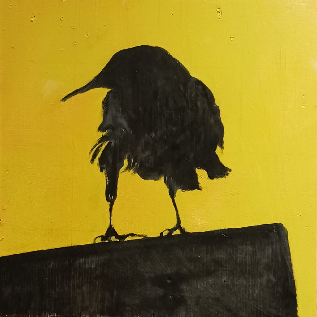
Roadsigns have an outsized significance to my worldview. This image comes from a visitor to my lunch break at Whole Foods in Las Vegas. It is a grackle, and may bridge any gap betwee Edgar Allen Poe and Twitter. It is acrylic on distressed panel, and has the frisson of cool, asymetrical rebellion, looking askance as though slightly miffed at the circumstances of corporate tech brand recognition and municiple policy enforcement.
Path Painting
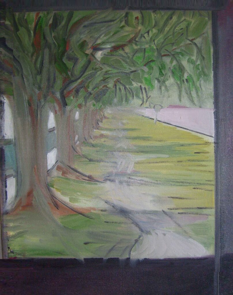
This is an old one, from around 2005. You can see the image is framed by sloppy cropping with paint. It shows the pathway along Memorial Drive in Cambridge Mass., when you cross the Charles River from Boston then go left along the river. It was my bike commute to Harvard, where I earned a bachelor’s degree at the night school. Perhaps it is the proverbial ‘garden path?’ A beautiful and inviting vision which ultimately requires a truncated world view to make ‘whole.’ As a kid, one of the most pleasant and romantic vistas I beheld was Cambridge from the Boston side. Great cultural sophistication and the comforts of prestige were nestled there among the mellow bricks and parkland. I got my chance to go there, for which I am thankful. Note the little roadsign. Maybe I can go and put Bird Zone on that sign some day!
Girl
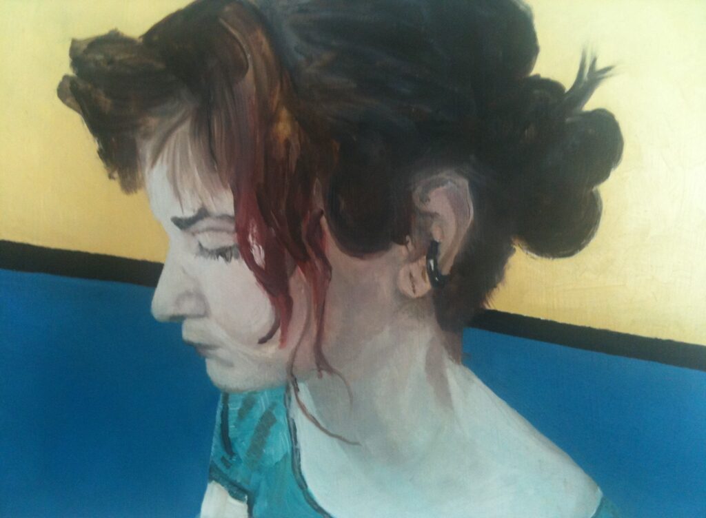
Here is a more realistic painting from a couple years later. Given my current method of working from photos, I am amazed to recall painting this from life, with the model in my apartment. Of course it was a romance, and though short-lived, the model was a family friend, from a very talented and successful family. As a hyper-empath, it is likely that her abilities in the visial arts somehow transfered to me in the painting session. This is small -about a foot high, but the little piece captures Zoey’s beauty as well as her vulnerability.
Dogs
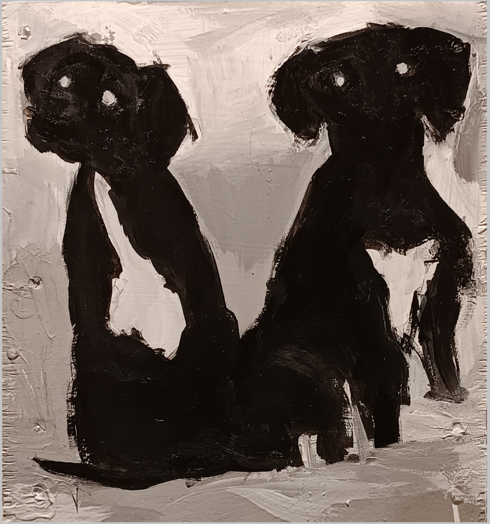
You can see my style is at times visceral, and always shows humanity in the subject (even inanimate objects). My first strong influences were the abstract expressionists like Willem De Kooning and Emile Nolde. These guys aren’t very popular now, and I would say the digital age has precipitated less soulful work. I’m not sure anyone cares anymore whether fine art has any reference to the greats of the 20th Century. Anyhow, here’s the kicker: someone told me this painting was racist, and reminded them of Al Jolson. Sad. I love these two -bonded by consanguinity, and polar in their emotions. Nice beta and cold alpha. Also interesting is that these dogs were sitting on a sofa in the background of some crazy youtube video with polce entering the home and crime afoot. So this is a painting from the internet, a view of a part of the digitized universe.
Moon Dogs
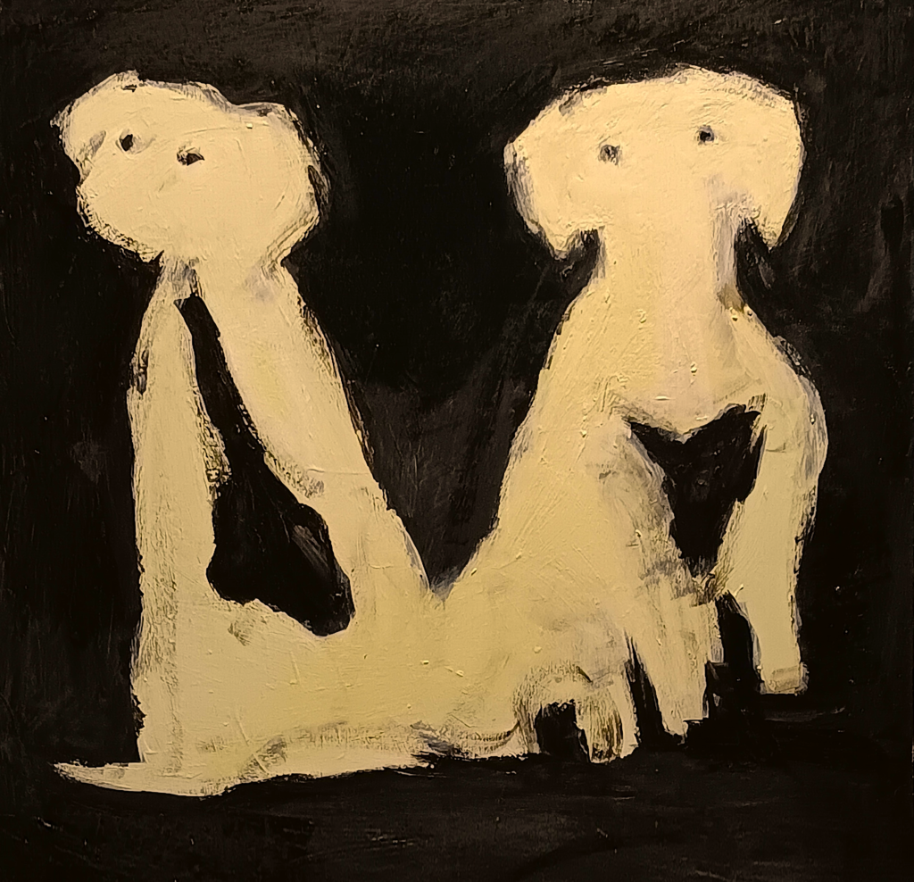
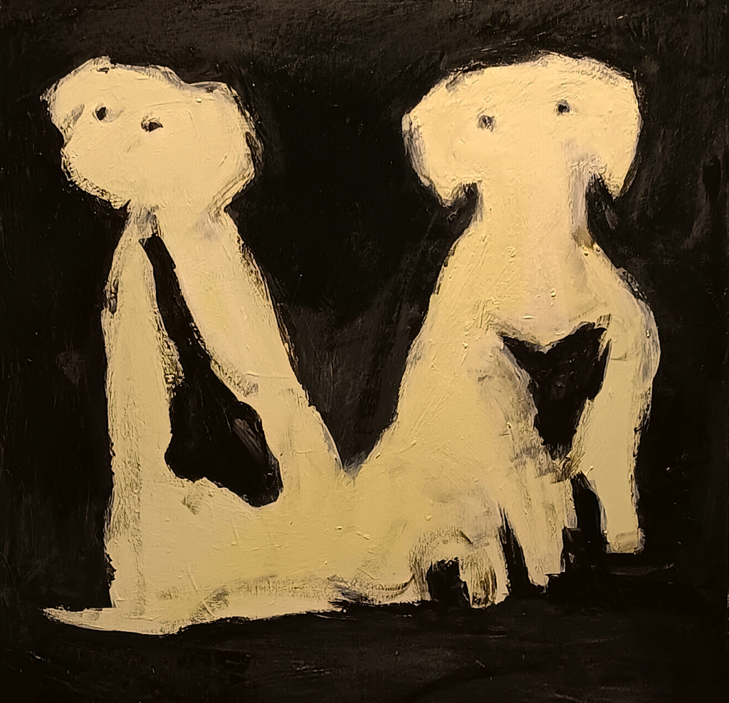
So I’m like, fine, I will do a white version, okay? It is all good. I think it’s important to engage with societal issues as an artist. My work is the most important thing to me besides people I love, but that does not mean we should be too serious, if another approach seems artful. It’s dangerous when putting your self into an original work inevitably opens you up to deep attacks. The reward is so great though. I always learn from what I create, and it is baffling that ideas emerge as thoough automatically. Here, it seemed to just turn out that these whities have a very lunar essence. It reminded me of the poem “Whitey on the Moon.” Look, the point is equality. Both paintings are equally idiotic. Masterpieces.
Guitar Corner
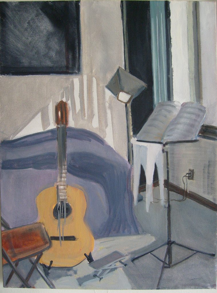
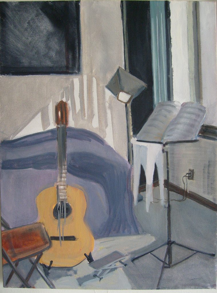
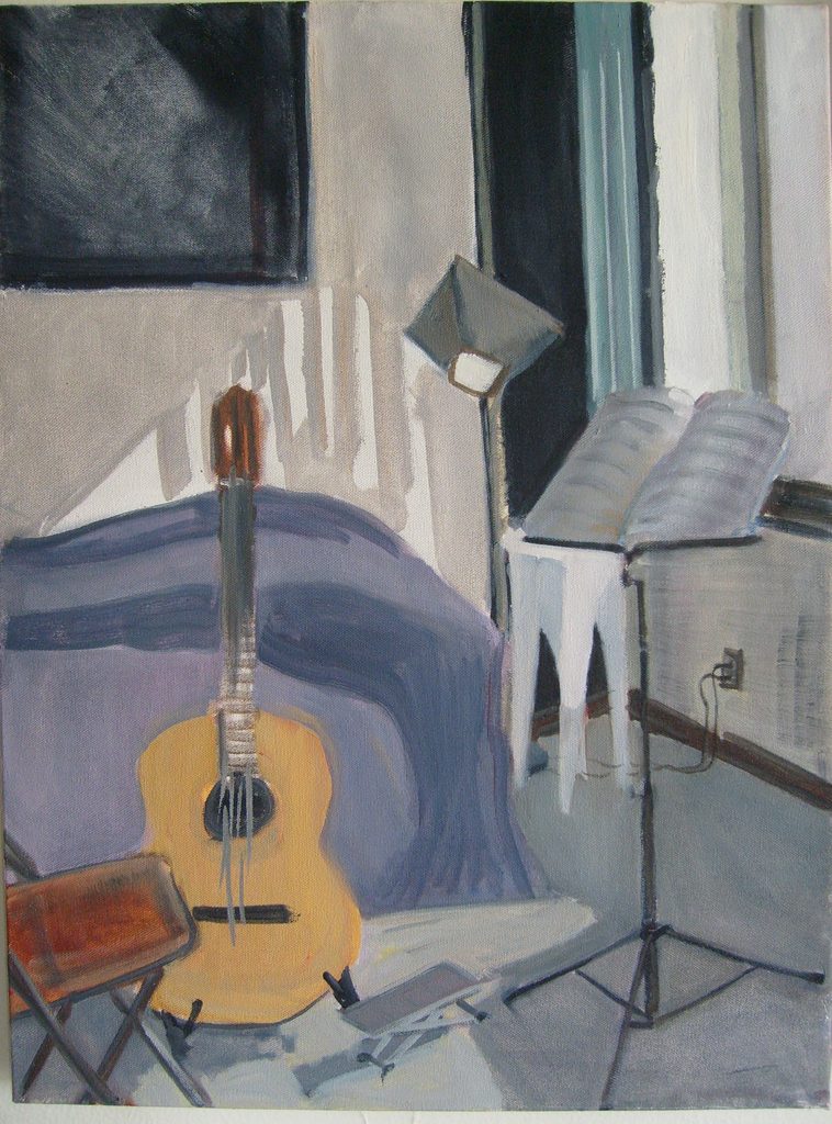
This is a real still life, from a light-filled apartment where I lived in my 20s and 30s. I showed this to a very competitive young man who said, “It looks like some training.” I think he was right that, technically, it’s not a masterwork. Neither are any of these paintings except maybe the animal ones. I’m getting more into that skilled look now, with the Starbucks one below and others comming soon. But I have to say, there is something about all of these paintings that goes beyond. just technique. Another, better-natured artist once told me, in the 90s, “There’s skills, and there’s taste.” For sure if something is tasteful, it can be great even in the absence of master skills. The reverse is not so. Anyhow, I framed this and gave it to my Godmother, who lives in San Francisco. I am a guitar player and this piece certainly carries something very personal to me. I always have that area in my home, where I go and make music. Plus look at the color, contrasting light values, and textures (including the canvas itself -yes this one is on stretched canvas). I think I caught the light.
Brick Building
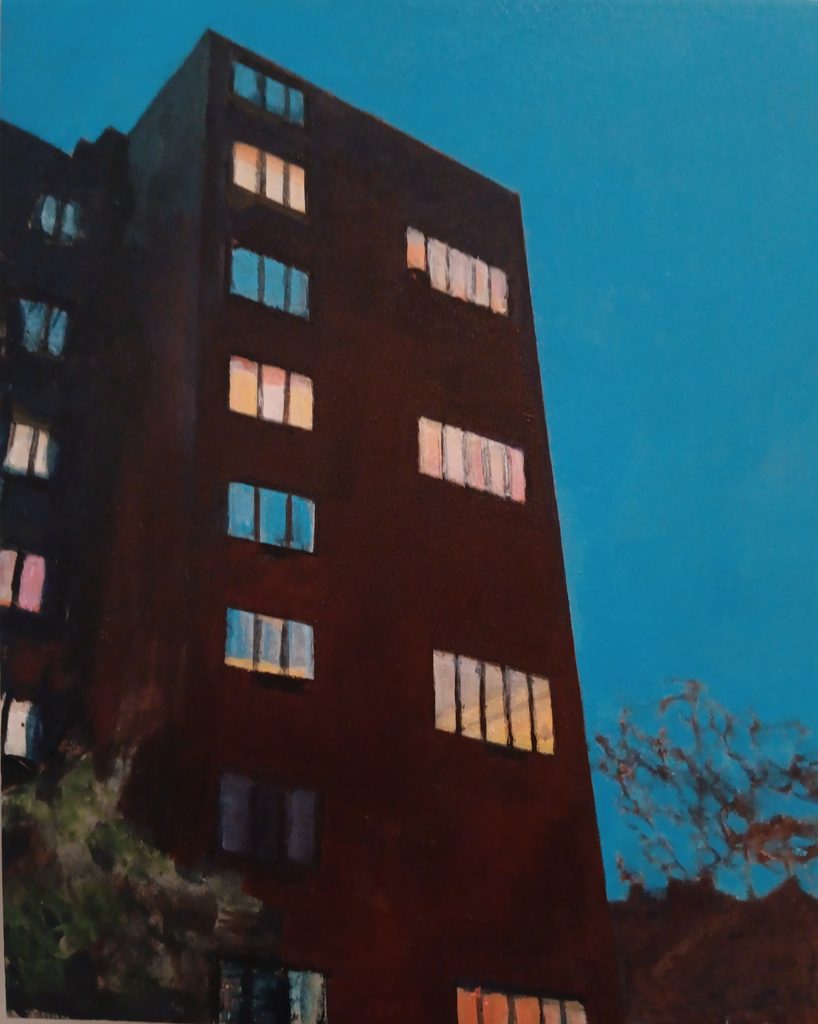
This apartment building is right by Harvard Law School, on a street that, one-hundred years ago, had a strem running down by it.. When I was a kid, I spent summers in Southern California and always was struck by the dark and heavy, monumentl quality of buildings of my home state, upon returning in the fall. I painted this in 2024 while living across the street. What struck me most then were the lives inside there, Each floor has its own cozy amber tones, while the facade meets the gloom on its own ground. You can see there are some photographic effects such as the harried tree branches and pale reflections onthe brick. This is when I started actually trying for what most people assume is the entirety of painting as an art form -effects from the application of the paint, to mimick how we see things. Obviously my work is also very much about symbolism, abstraction and cultural reference. This is in fact a dark tower of cold elitism today. And there’s a lot to be said for mood. I love the feeling of a brisk wind that says winter is comming, and the excellent fashion of dress in the Northeast. Better get a good coat and scarf.
Best Starbucks Ever
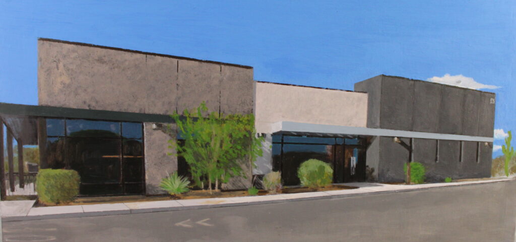
This painting is from 2025-26. It is a Starbucks in River and Stone, in Tucson. It is the best Starbucks for a variety of reasons. I painted this from a cellphone picture. The sad irony of the screen staring era we inhabit is celebrated here, as I let my phone do all the calculations. Really, it’s just the slight fisheye the phone did. For me the detail peaks on the shiney glass closest to the viewer. These post-modern buildings look like CAD, so this is a screen image of a photograph of a painting of a phone image of a picture of a building that looks like the computer screen it was designed on. I think it’s pretty crisp, and has a nice horizontal sweeping motion. It’s small -about a foot high and two feet wide.. .
Self as a Young Man
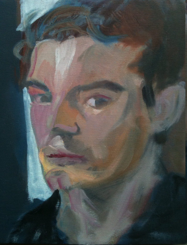
Either you like my style or you don’t. Next, below, you can see I have finally gotten old and started to appreciate detail -what so many people look for first in visual art. Since my twenties here, and before, I have been more about gesture and color and the liminal space of cognition where reality and imagination comprise the actual human experience. I must admit a little Van Gough essence (scary for me), and also a definite nod to what I assumed in the 90s, and now continue against all odds -the image of an artist as a very intense, smart, critical and crazy soothsayer, who casts psychologically interesting objects of contemplation which expand humanity..